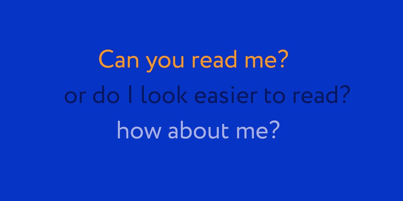
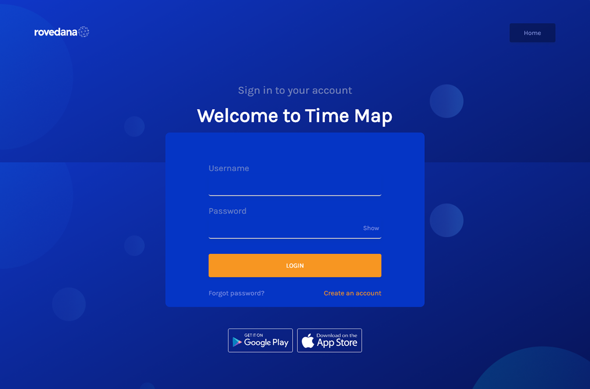
I recently joined the team at Rovedana as one of the company's first designers. While being onboarded on the company's in-house tools, I observed again how much chaos there was in the visual design system (particularly color contrast) of the products I was being onboarded on (I had earlier observed it on the company's website when I was preparing for my interview) .
April 2018
UX Research

I set out to solve the observed problem by:
1. studying the current situation of color usage across board
2. examine what standard looks like (WCAG 2.0 AA Color Contrast Levels)
3. suggest a new inclusive strategy

Why do I care?
One of the things that designers should be aware of is how to comply with accessibility standards to include as many people as possible. One way to do this is to ensure our designs have sufficient contrast between text and background colours for people to easily read. This is not just for people who have low vision or certain eye conditions, but also for those with older and cheaper devices, times when there’s direct sunlight or glare on screens, and when we’re in dark environments.
250 million people world-wide have a visual impairment, which includes anyone from legally blind to having less than 20/20 vision. We also have to remember that visual impairments aren’t just permanent, but can also be a temporary or situational impairment as well — meaning we will all suffer it at some point. A great example of different forms of disability has been put together by Microsoft for their inclusive design toolkit.

What are others doing?
Inevitably I asked myself — “Do other companies have a similar problem?”, “What do they do about it?” and “Do they meet AA standards?”
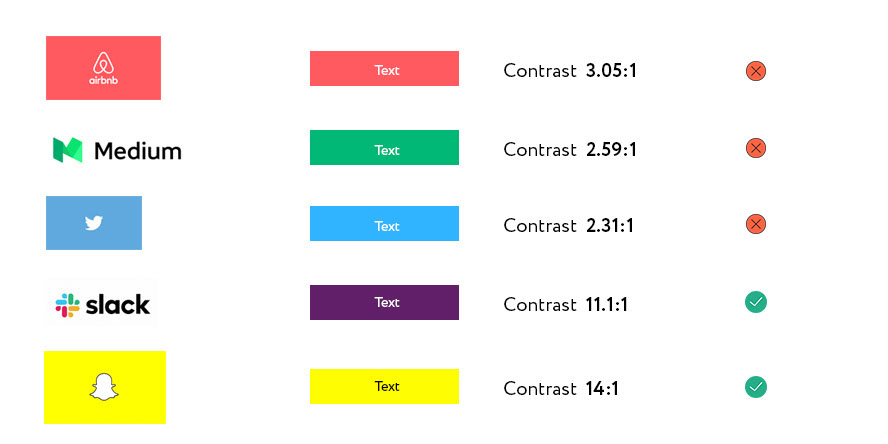
Whilst comparing yourselves to others should never be the go-to, I was curious to understand what other companies were doing. I looked at their choice of color and how it shaped the way information was layered on their website/products.

As you can see a lot of well known companies don’t actually have text on base colors that meet AA contrast ratios. Most of these companies would no doubt have accessibility standards, but when it comes to something as simple as color to text they fail the minimum contrast test.
All I can conclude from this is that branding is seen as a higher priority than accessibility…and I get why — visual branding is a big part of what makes a company recognised and loved by people, to change it after people have grown used to it could be seen as too big a risk.
The only way to avoid these situations is to prioritise accessibility and inclusion at the very start of a company. If you’re one of the very first designers in a company make sure that accessibility has a voice in the early stages so others don’t have to make a choice between accessibility and branding later on — don’t wait for the rebrand to happen to fix it. 😇
…oh…and what happened to the use of colors on Rovedana's products you ask? I presented a case for going with darker shades of our primary orange color and it was welcomed. Now all our design interfaces carry a uniform visual identity 🤓