I got into this challenge organised by The Design Institute, Lagos and we were tasked to redesign any mobile banking app for Android and iOS devices. I was happy because I finally would do something about the not-so-great interface I saw when I updated the AccessBank’s mobile app in December.
Jan 2018
UI/UX Design

I immediately swung to User Research Mode; I walked through every part of the app WITH all of me paying attention to details. I wrote down things I noticed.
I proceeded to PlayStore to read what people are saying. As much as I was seeking information; I tried to distill what’s really important for my research. Some of the actionable feedback I saw after flipping through lots of reviews are:
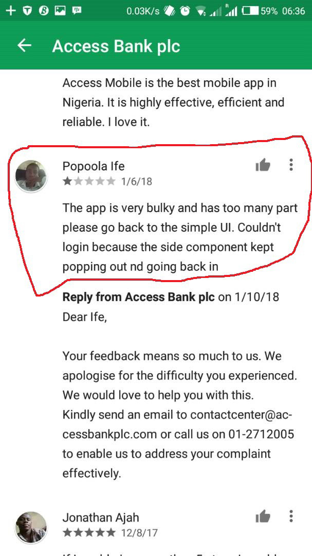
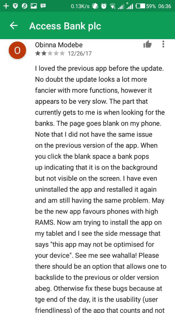
I was really intrigued at the way people give feedback; the picture by the right hand above said a lot of things:
1. the current UI of the bank is fanciful which the writer thinks invariably makes it slower.
2. he could not search for his bank and thinks the current UI makes ‘the search bank tab’ somehow less visible.
These are actionable feedback. I juxtaposed with my thoughts about some of the pages mentioned and I felt great I was doing something right. I also put a post up on Instagram and got quite some feedback.

I immediately swung into sketching on paper my thoughts about how the app should look like whilst taking into consideration the feedback I got from my user experience research earlier. After 3 iterations and discussion with my colleagues at MEST I came up with this.
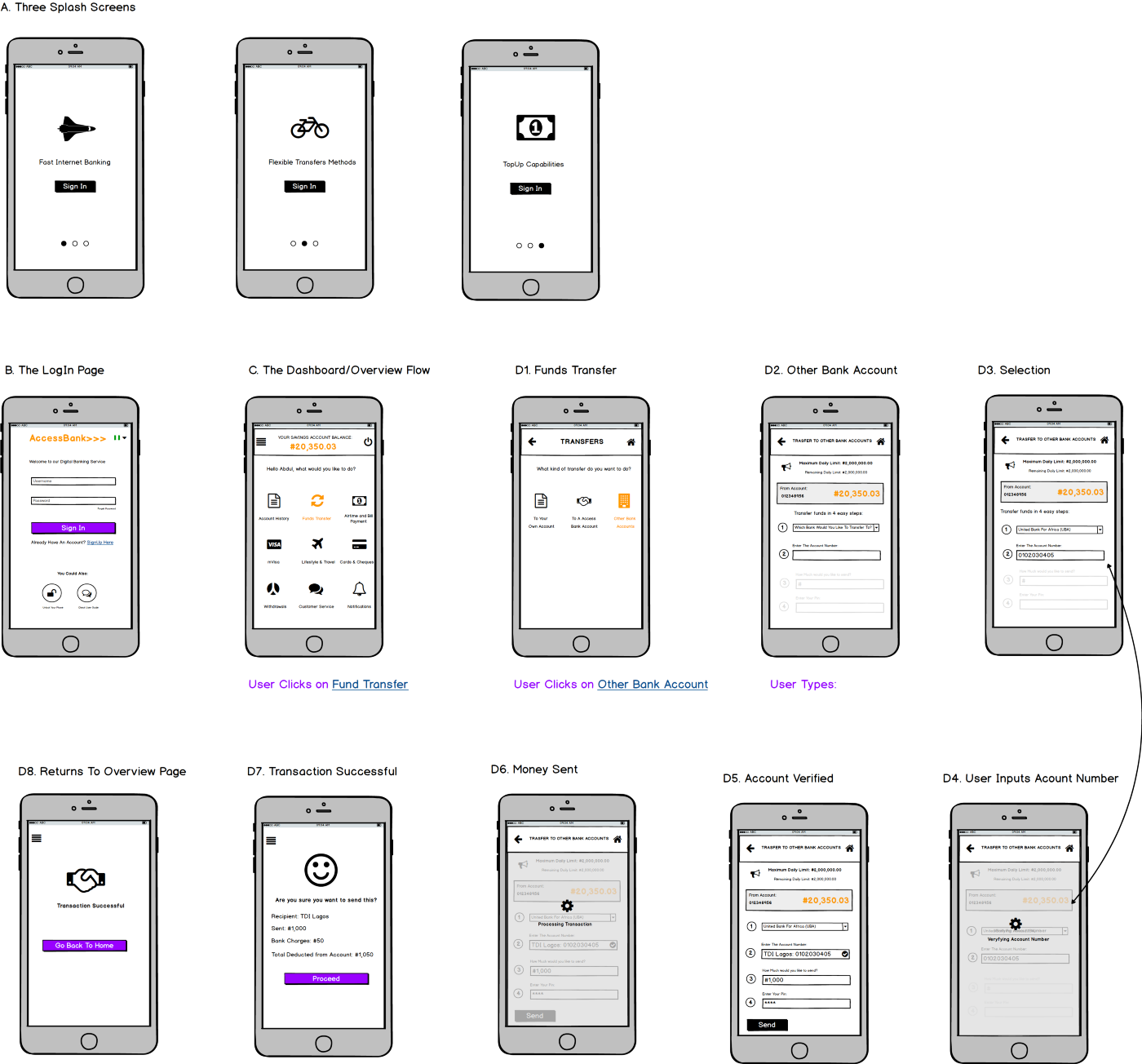
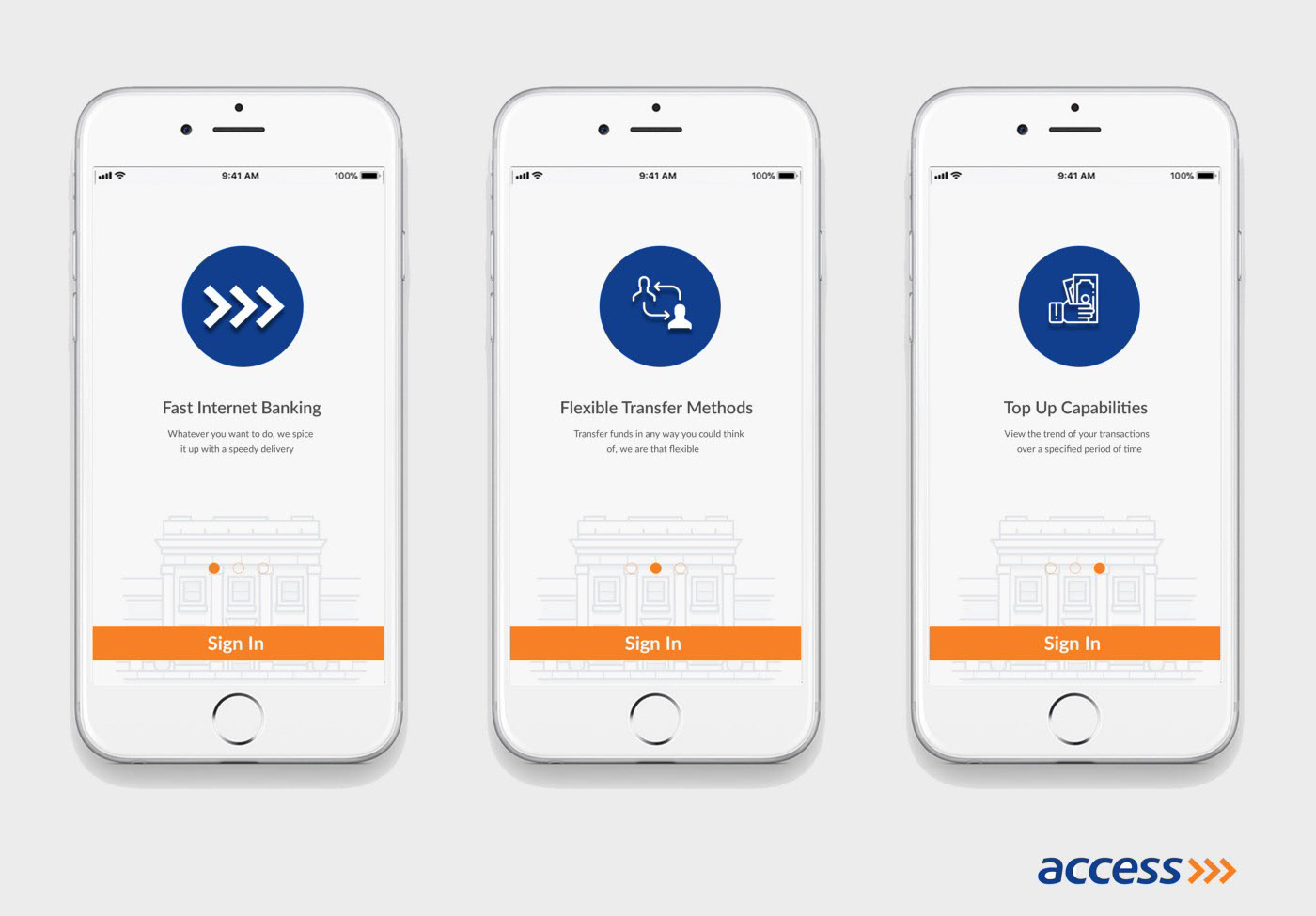
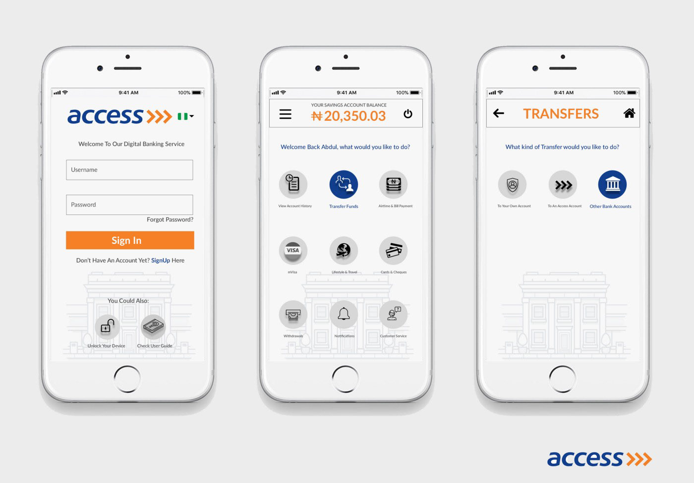
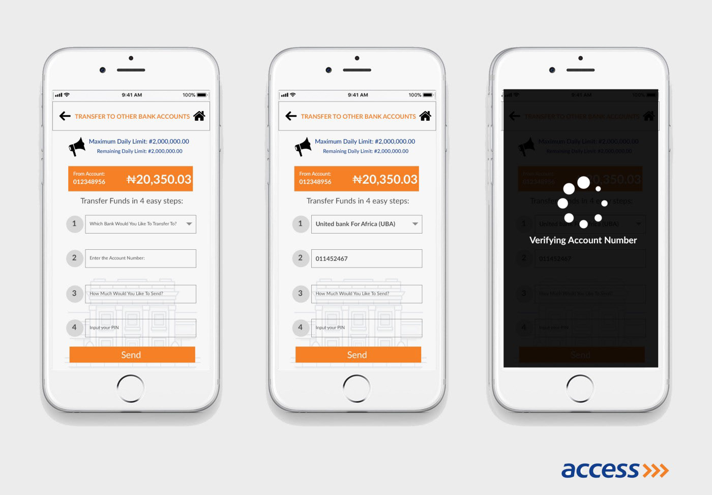
After conducting a mini user interview to test if the screens are functional and got some great feedback. I was ready to proceed to Hi-Fi and here are my designs:

Here is a link to the prototype on InvisionApp:
What do you think about my approach?
Its my first Medium Post and I am glad am talking about products yeah.